Emergent Democracy
Some really interesting thoughts on technology mediated democracy.Power and Weakness
I think this paper by Robert Kagan has some genuine insight for anyone that is struggling to understanding the growing rift between US and European foreign policy....Today's transatlantic problem, in short, is not a George Bush problem. It is a power problem. American military strength has produced a propensity to use that strength. Europe's military weakness has produced a perfectly understandable aversion to the exercise of military power. Indeed, it has produced a powerful European interest in inhabiting a world where strength doesn’t matter, where international law and international institutions predominate, where unilateral action by powerful nations is forbidden, where all nations regardless of their strength have equal rights and are equally protected by commonly agreed-upon international rules of behavior. Europeans have a deep interest in devaluing and eventually eradicating the brutal laws of an anarchic, Hobbesian world where power is the ultimate determinant of national security and success. ...Although long winded at time, it does shed some light at what may be going on in the heads of the Bush administrations, but also the Europeans resistance to follow.
Looking for Madam Tetrachromat
First, I read this article on Synaesthesia a condition where people's senses mix. I had read some about it earlier but learned a lot of new stuff. As if that was not fascinating enough a little comment mentioned the phenomena Tetrachromat. A condition where certain women have four color receptors instead of three. A visit to Google and it found me this article.iGesture
This looks quite cool. However, I wonder if the commands are not a little too complicated, too many fingers involved. (via unsanity)Weblogs and power laws
Both Jason Kottke and Clay Shirky are talking about the power law distribution among weblogs. That's not really surprising, what I would be much more interested in knowing more about is the ways it tends to breaks it for other media. At the end of the day when I look at what I have read, the variety of sources weblogs point me to never ceases to amaze me. Readers of traditional media be it online of offline don't get this breadth. My hunch is that the typical webloger is more loyal to an idea than a source so he tends to link whoever expresses it the best.I think it would also be really interesting to look how Comments, RSS and trackback like features have a tendency to mitigate the power curve, specialy if you count voices or memes instead of weblog popularity.
Improving the Safari user interface.
Dave Hyatt has called on Safari user to to give suggestions on user interface improvements. Here is my take on an already very good browser:
Tabs: I guess this is the most requested UI feature. Although I love the tabs in Chimera I think we need to find a smarter implementation. Ironically the main issue I have with tabs is that I love them so much that they fill up too quickly. So when surfing with Chimera I tend to have multiple windows open full of tabs and then finding a particular page tab put's me in a worse situation as I can not use a window menu. Instead, I have to scan the tabs of each open window. Having said that if implemented as tabs, use the favorites bar and make the bookmarks a permanent tab:

Just push the standard favorites to right as you open more tabs. Another, probably better possibility is drawers.
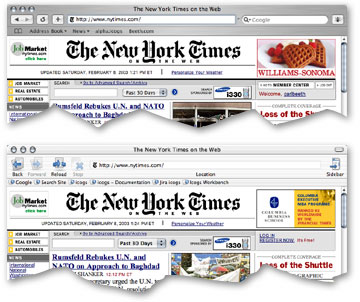
The brushed metal look: Here I will differ from the general Mac community in saying that the main reason apple tends to use brushed metal over standard Aqua for so many of their applications is that Aqua is not that good. It tends to be too high key. Here is an example of a web page viewed with both interfaces:

Notice how in the chimera screen shot the web page blends in with the UI. This is not a good thing and affects many Aqua applications. The Standard Aqua theme is about 5% and does generate enough contrast between the document and the user interface. Now brushed metal on the hand goes from around 40% to 20% and tends to contrast too much, the light to dark fading can also be confusing. what Apple needs here is a new theme that is somewhere in between these two. Something between 15% and 20% would be good. Irony is that OS9 averaged about 20%. With Apple wanting to clearly differentiate OSX from 9, the likelihood that Apple will listen is probably zero. One interesting side note is that the choice of brushed metal has allowed them to reduce the vertical space that the UI takes up, a good thing!
Shortcuts a la Chimera and OmniWeb is a must and simple improvement. Plus then possibility to hide the Google search box.
A wysiwyg activeX like component: This is desperately needed in OSX Browsers. Hopefully it would be part of WebCore and better than the one offered in windows. The most important thing is that it has to be real easy for web developers to implement without requiring browser sniffing. Jim Ray has other good ideas for WebCore
There is also plenty of attention to detail I like:
- The shaded link box when you drag and drop a URL. Should maybe be extended to the address bar and bookmarks. (Consider even adding it to cocoa framework for other programs to exploit)
- The way bookmarks are organized and presented. And the possibility to have the bookmarks as the default view when opening a new window.
- The lack of fluff. I don't want to see Safari merged with NetNewsWire, Sherlock and co. Keep the browser simple and concentrate on cross application integration. For example allow some kind of way for the user to transfer a RSS link to NetNewsWire or another RSS reader.