Design - **010 - via Treehugger - 30 Jan 2006 18:36
Web Design, Design - ***010 - 24 Jan 2006 19:29
Masai Barefoot Technology
 Yesterday I was talking with Christian Lund and he told me about his new "Masai Barefoot Technology" shoes. The shoes have a rounded sole that apparently helps in many ways. I have to try these shoes if for nothing else the coolest brand name in a long time.
Parody the sincerest form of flattery?

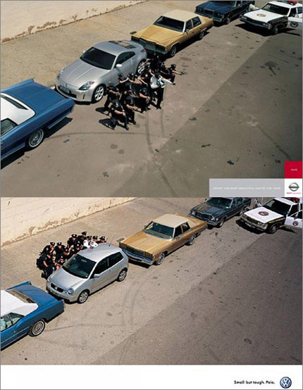
Frederik Samuel noticed something strange with these two ads.
What is TBWA trying to do here? It's not a spoof becuase a Golf is hardly in the same class as the 300Z. Everything is the same except that this time the cops are protecting the car except being protected by it.
Parody is great when you know what is being parodied and that is what makes this TBWA Nissan parody of the VW ad so strange, nobody outside the advertising world will ever understand the joke on the polo ad but still they have gone through a lot of expense to almost clone the Polo ad, if you look carefully you will notice the cars are very similar but not the same, the location is exactly the same or is the sidewalk and wall just photoshoped back in? In any case it seems like a lot of expense for a parody that very few will ever understand. Now the strange thing is that there are a bunch of other copies of the Polo ad.
filed in: Culture, Design - via Reklamfeber.se - 02 Dec 2005 18:48 - #
Micro House
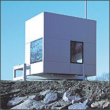
 Via a BBC article I bumped in to a cool micro housing project base on 2.6 meter cube made by a team of students lead Richard Horden. I have always had a fascination with small and efficient living spaces, maybe it is from my childhood building tree houses with my brother and cousins. These cubes look very interesting but I wish I could get more information about how the space works. I think that as you reduce space, architecture has to get closer to industrial design and I get the feeling that these people understood that, in a way the whole thing becomes more like a spacial furniture appliance.
Managing for Creativity
The Harvard Business Review has an excellent article on managing creativity viewed through the practices of SAS Institute
...SAS recognizes that 95% of its assets drive out the front gate every evening. Leaders consider it their job to bring them back the next morning...
...In the creative economy, time is precious. And as much as creative people like to feel challenged, they don’t want to have to surmount unnecessary obstacles. The former situation inspires greatness; the latter, migraines—hardly an ideal condition for creative thought. So SAS takes great pains to eliminate hassles for workers wherever and whenever it can, both off and on the job...
...Creativity can’t be shoehorned between the hours of nine and five. The Muses don’t always show up on time for appointments...
Well worth the read if your company lives on creativity and which company does not these days.
The Decline of Fashion Photography
 Found this little gem among Kottke’s best of 2004.
Recent fashion photography also is more than a bit misogynistic. That is the second thing these various trends have in common. If photographers and editors really cared about the role of women in society, they would use models above the age of 20, who look like they could complete a sentence.
Even though the presentation is very linear it’s nice to see people using the web medium and not just porting over articles.
filed in: Culture, Design - via Kottke - 28 Dec 2004 13:35 - #
Crazy Road Design
Design roads so they look dangerous and people will be more careful. Wired has an interesting piece on how this is starting to happen.
"The trouble with traffic engineers is that when there's a problem with a road, they always try to add something," Monderman says. "To my mind, it's much better to remove things."
Design - - 15 Apr 2004 20:29
Design - - via boingboing - 21 Dec 2003 15:04
Design - - via boingboing - 19 Dec 2003 19:02
Project Looking Glass
Although this Sun 3D desktop demo is quite cheesy there are two very cool things that should be looked into:
- The back of the window concept, in this demo it is very crude but the concept is very powerful and already used very creatively by some applications. I would love to see it generalized as a OS level feature.
- The spine of the window, this would be a great way to improve on exposé.
Now the interesting thing is that these features don't require 3D, sure the animation of flipping the window should be in 3D so would the turning the window to show it's spine but that does still not require the whole desktop metaphor to be a 3D environment. I have yet to see a compelling argument for that.
Lovemarks - Brands that people love.
Sadly the site is bad but the exercise is cool.Design - - via boingboing - 26 Nov 2003 18:35
Design - - via Signal vs. Noise - 09 Nov 2003 20:04
British Designer of the Year
Yesterday I saw the British Designer of the Year Award on the BBC. Not surprisingly Jonathan Ives from Apple won, but what caught my eye were two of the other nominees.First of all the simple fact that Rockstar Games was short listed for Vice City was obviously a controversial choice for a design award but it was also very well deserved. Vice City is the first game where where I have really felt like I was in another place.
 In
my opinion the coolest thing was Tord
Boontje's lamp shade. Made and delivered as single acid etched A3 brass
sheet that you just wrap around a normal light bulb like hanging a garland on
a xmas tree. Sadly none of the links on the web does it justice, The way it
projects the light is as important if not more important that the look itself.